Wednesday, 29 October 2014

What if?: Metropolis - Starting Point/ Influence Map


For this second project, we are to design another city, this time keeping the work of a well known artist in mind at all times. We are to design this city as if we had the mind of this artist, and make use of their styles, mindset, and ideals.

The artist I have landed with is Pablo Picasso, as you can see. A difficulty of working with such an artist is that there is no specific "Picasso-style". Throughout his life, he took up a variety of styles and recurring themes for his paintings and other artwork, at different periods. Two of these most well-known "periods" are his "Cubist period" and "blue period", which have both been heavily used in the influence map above. This raises questions to whether I should mainly take influence from a specific period, or if I should incorporate elements from them all.

We'll see.

Thursday, 23 October 2014

Invisible Cities - Interior Shot FINAL

It'll do.

Invisible Cities - Exterior low-angle shot FINAL

Argh, more stuff I wish I had time to do more with.

Now to finish The interior shot.

Invisible Cities - Exterior establishing shot FINAL


One down, two to go! So much more I wish I could have done with this, but alas.

Disregard the previous (now deleted) post, have made a few few adjustments I forgot to do initially.

Invisible Cities - Interior shot progress

Getting there.

Invisible Cities - Exterior Low Angle Shot - Further Progress


So here is some progress on the Low Angle shot. Same deal as previous post.

Without signs:

Previous update:

Invisible Cities - Exterior Establishing shot - Further progress

 The exterior establishing shot continues to be refined.

Here is what it looked like prior to the signs being added:

And to refresh your memory, here's what it looked like on my last progress update:

Wednesday, 22 October 2014

Invisible Cities - Exterior shots progress


Above is an early look at my Establishing shot and Low-Angle shot respectively. I took Thumbnails 45 and 52, and used a variety of the building types I posted earlier to give the buildings a bit of shape. Now I will draw over the top of these to create my final images.

My Interior shot will most likely be based on Thumbnail 46, and take the form of a shopping mall, but more on that later.


Invisible Cities - Tamara Lettering

The focal point of Tamara is it's signs. Naturally, there's going to be a lot of lettering visible. However, I don't think it would feel right if it were all in English. I want to make the people viewing my city (you guys) feel foreign, and like a stranger to it. So I quickly scribbled up a new alphabet just for this project. Some notes:

-It is to be read from bottom to top. [Paragraphs being left to right.] This is to give it a bit more of a city feel, as if the words are expanding from the ground like a skyscraper
-The Oo and Oh are just representing different pronounciations of the letter O of our alphabet. For example, the Os in "Photo" would be "Oh".
-S multiple is the S added to the end of a word to signify there is more than one of it. 'S is to be used instead of S to imply ownership.
-E Punctuate  is the E added to the end of a word to signify when a vowel uses it's single-letter pronounciation, for example, "Hate", ect.
-There is no Q or X. When these letters pop up, they will be made using a number of existing letters to form their sounds.

Here's now it looks in writing:

Invisible Cities - Architecture silhouettes


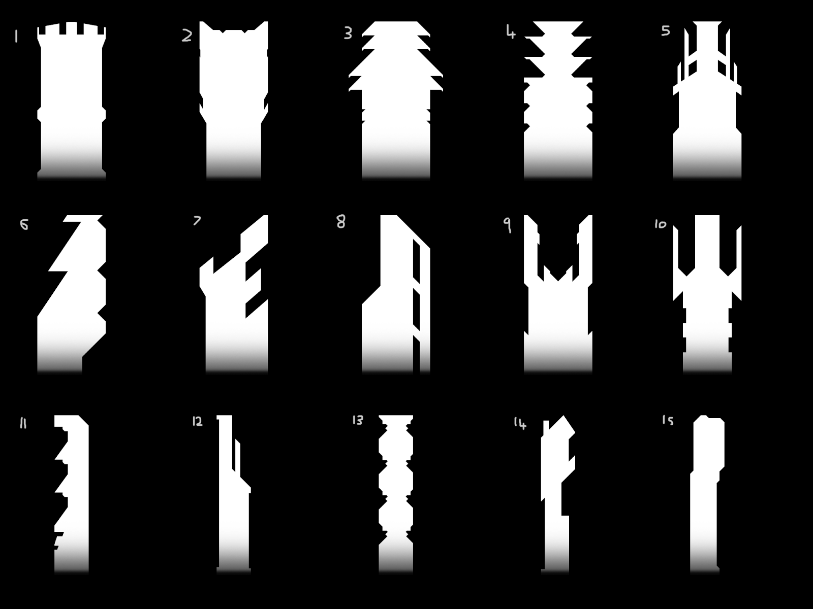
Since I did not want my city to consist of purely generic skyscrapers and buildings, I tried experimenting with different shapes for how the tops of large buildings could look, just to keep the city having it's own "flavour". Though keep in mind the city I'm working on is Tamara, so I want to keep the architecture fairly minimal, nothing too fancy. Reason being that I want more focus to be placed on all the signs that will be covering the buildings.

Worked on this Monday, forgot to upload it then.